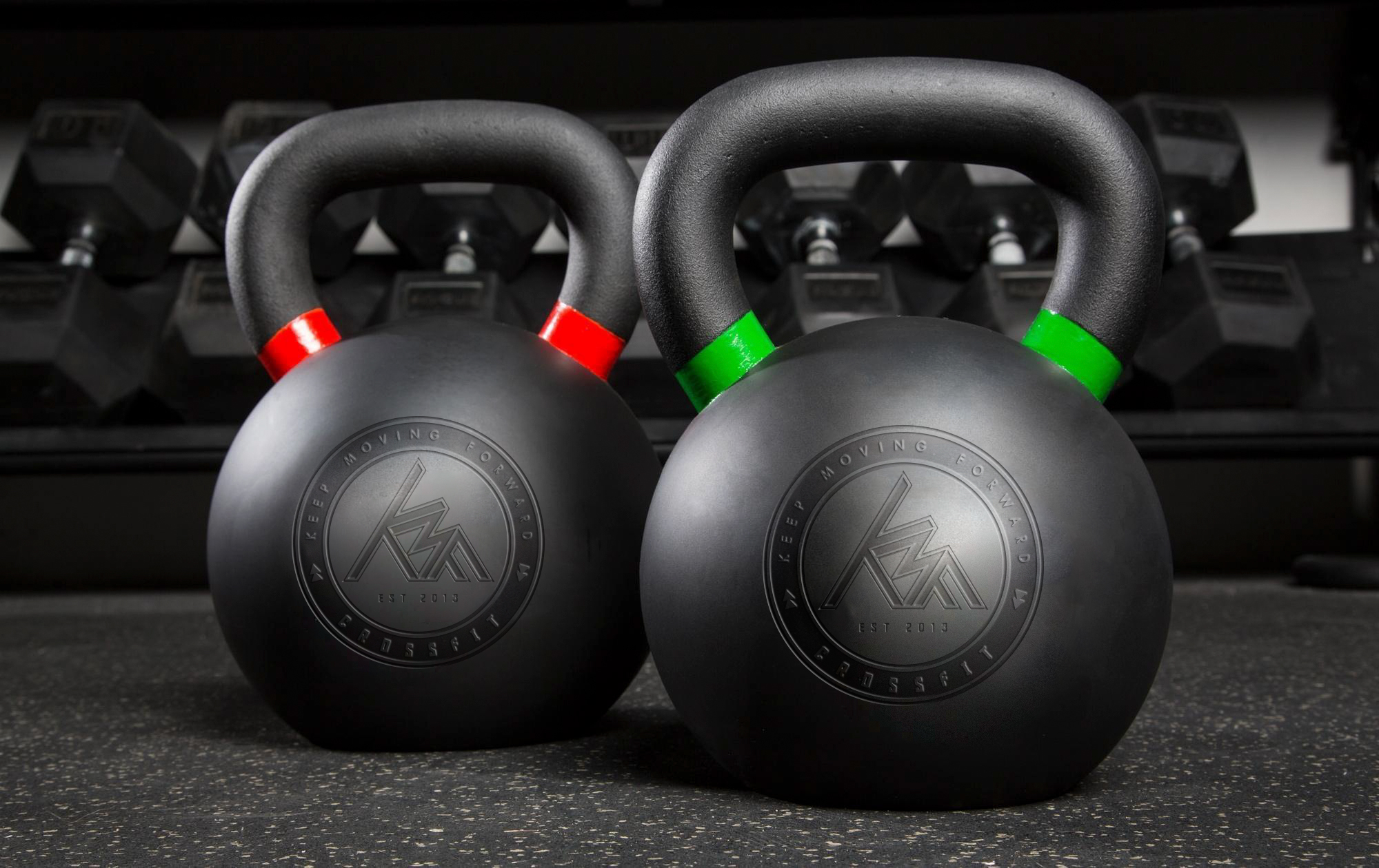
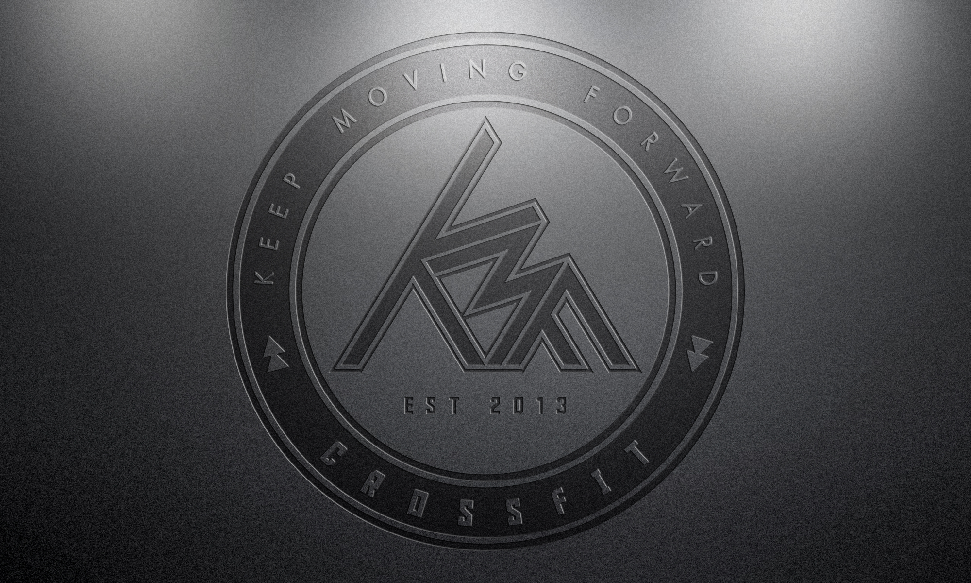
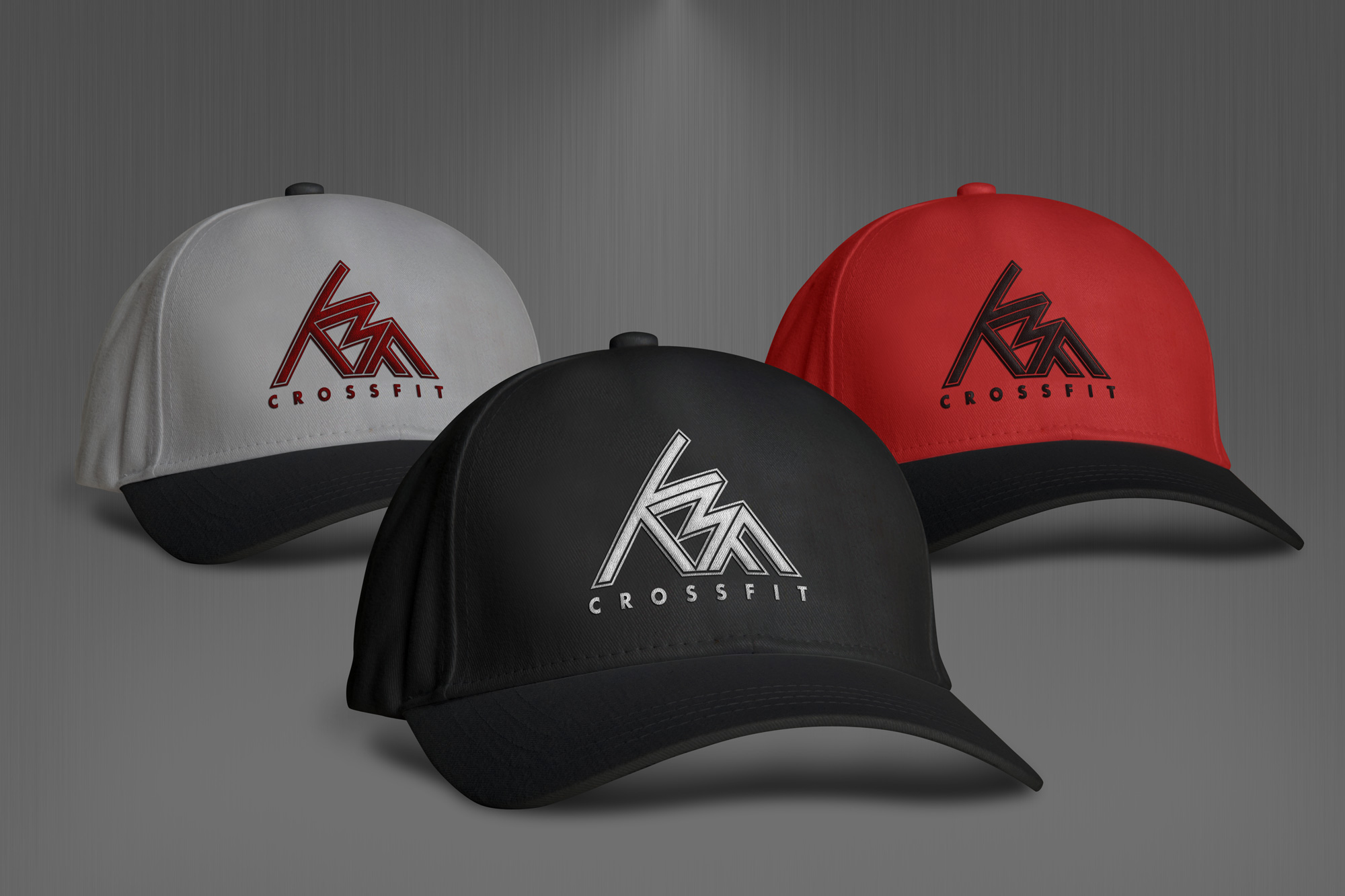
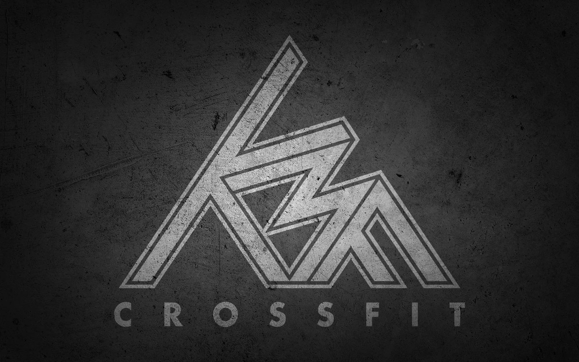
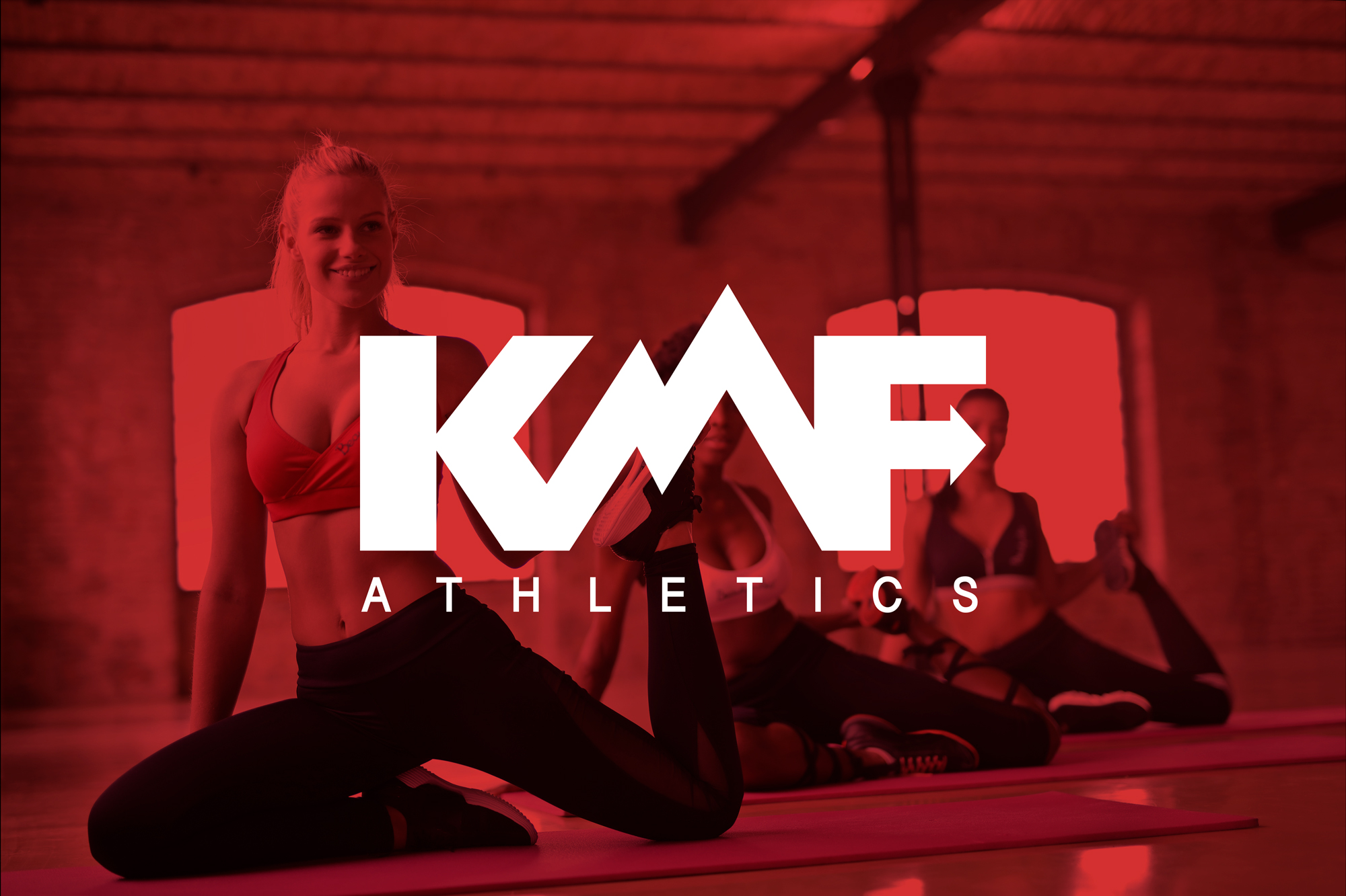
BrandingKeep Moving Forward
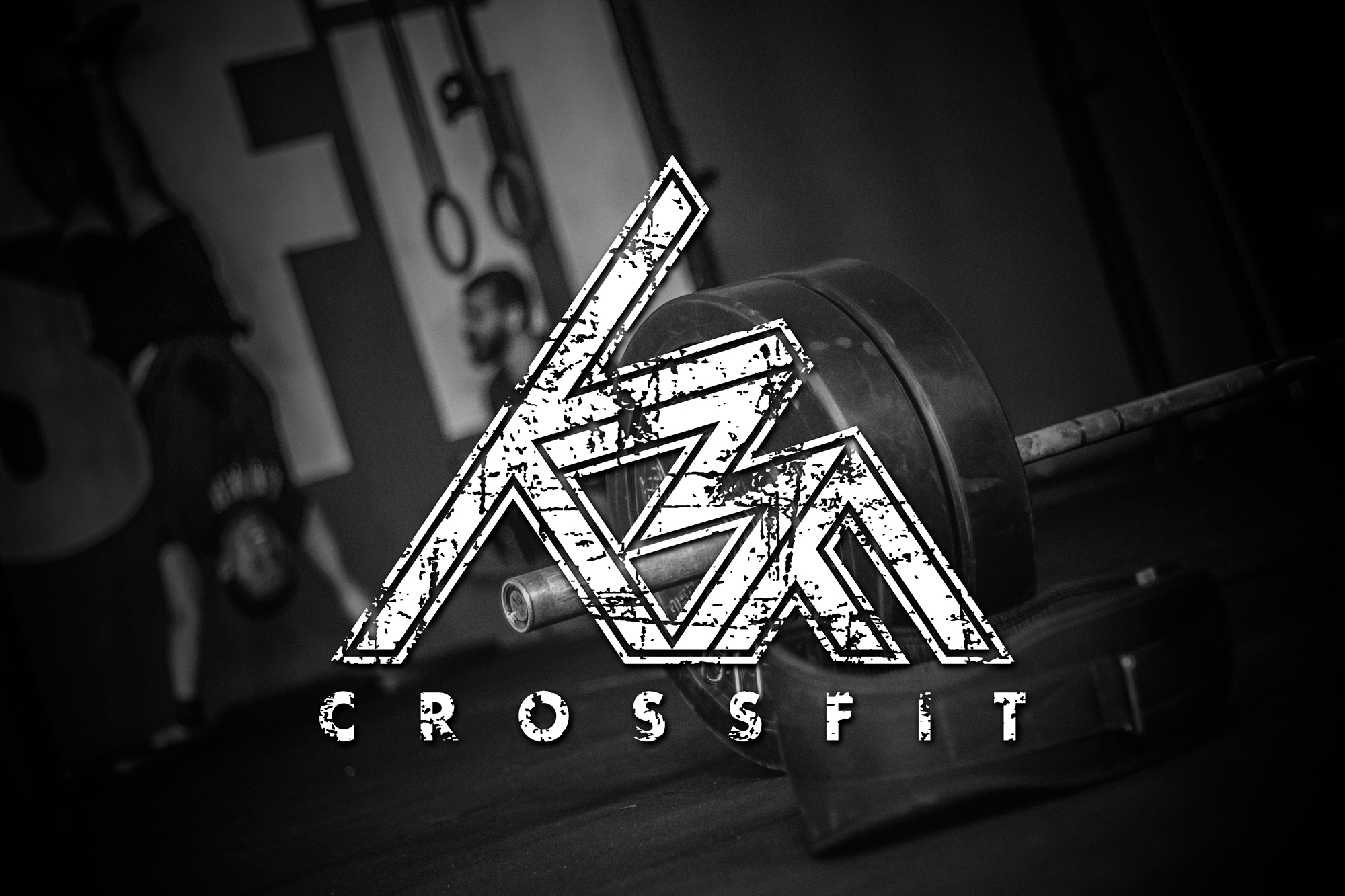
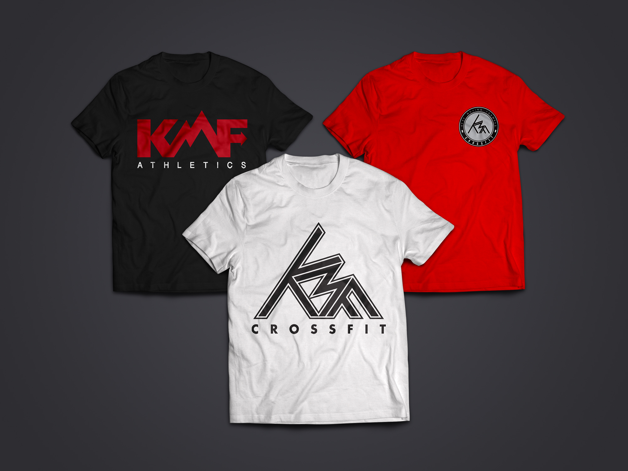
KMF (Keep Moving Forward) CrossFit is San Diego's friendliest state of the art CrossFit® box designed to suit all athletes from beginners through to advanced competitors. The client wanted a visual identity with a simple and clean look versatile enough to appeal to both men and women. The KMF forms a triangle shape, representing a mountain, and symbolizing the journey of overcoming obstacles while working towards a goal.
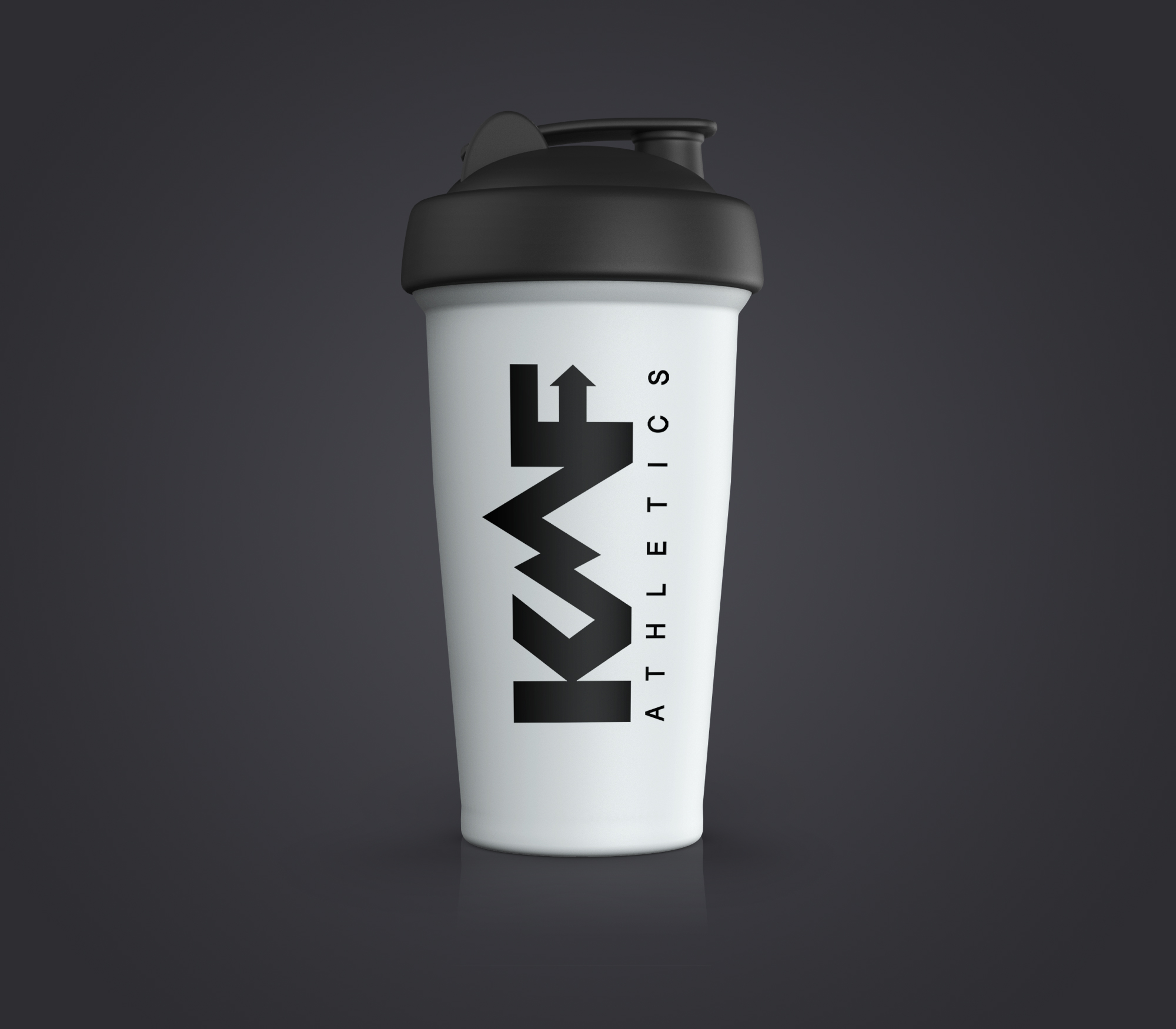
In addition to a mark for their gym, the client also requested a different logo for their athletics line, KMF Athletics. This mark was created with the idea of trying to bring more visual meaning to each letter. The 'K' resembles a start from beginning button, symbolizing the idea of setbacks one might face on the start of their journey. The 'M' resembles a mountain, representing the obstacles along their path. Finally, the 'F' integrates an arrow in order to further convey this forward progress, tying together the concept that 'Keep Moving Forward' embodies as a brand.