BrandingKarlaRod Photo
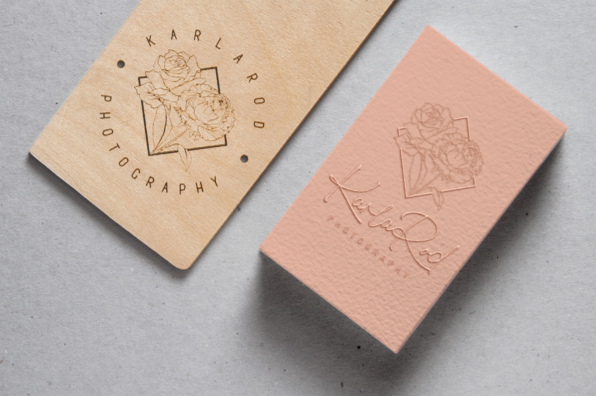
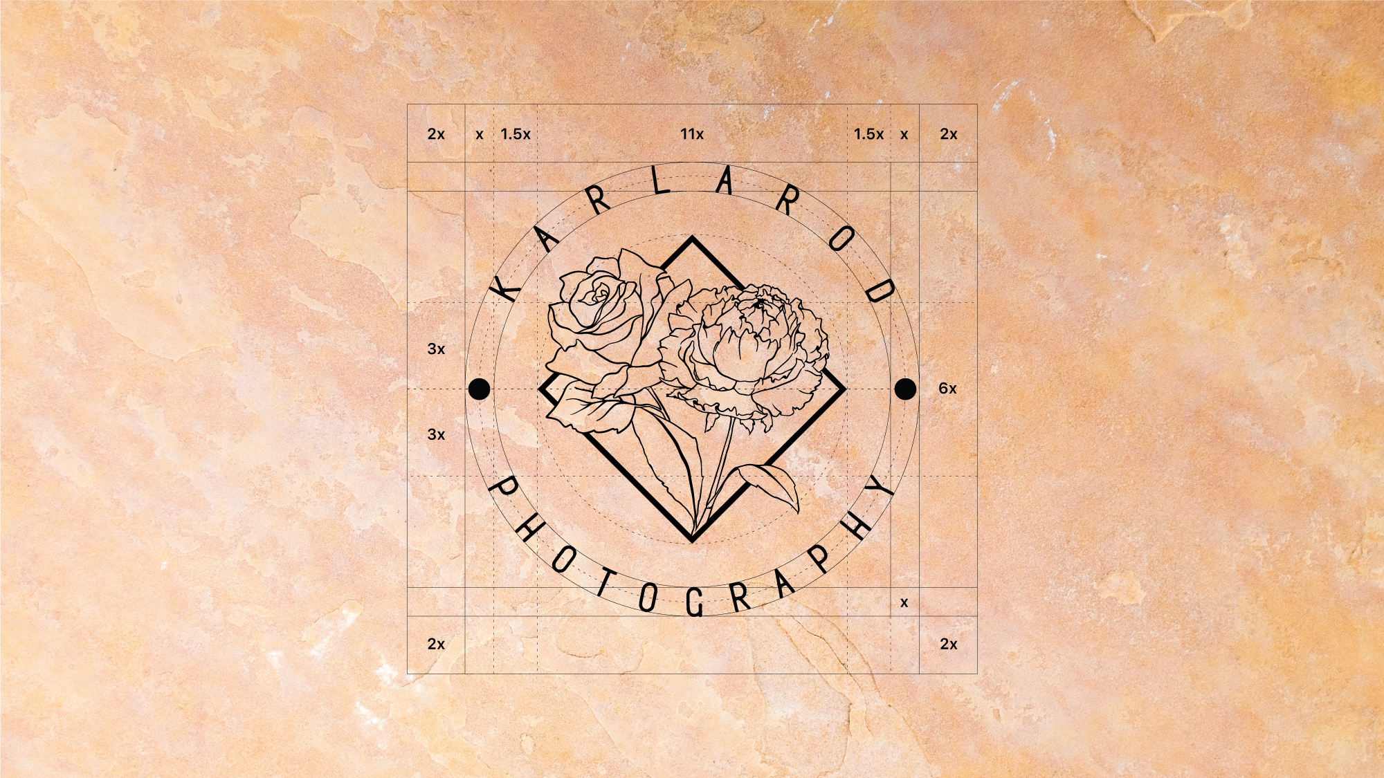
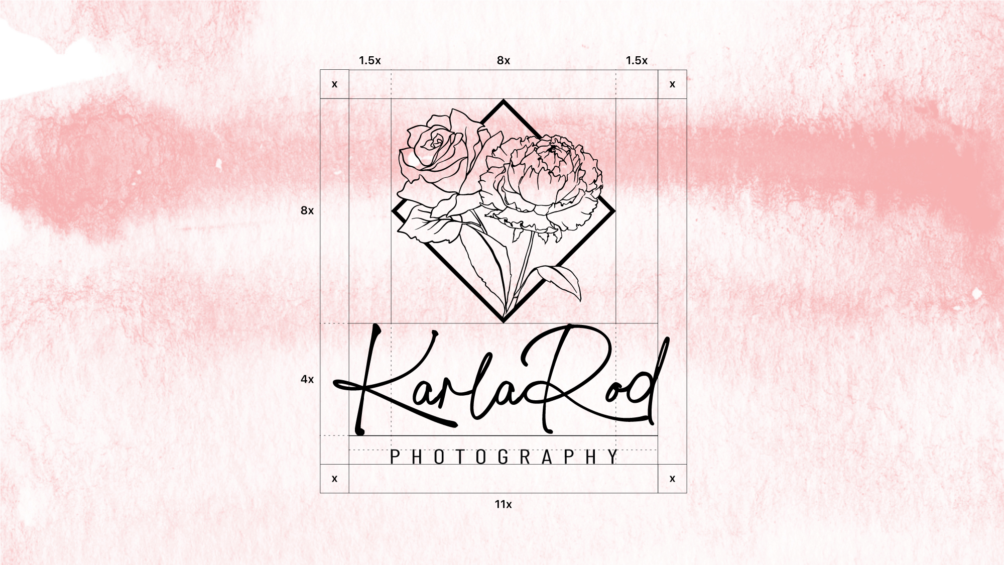
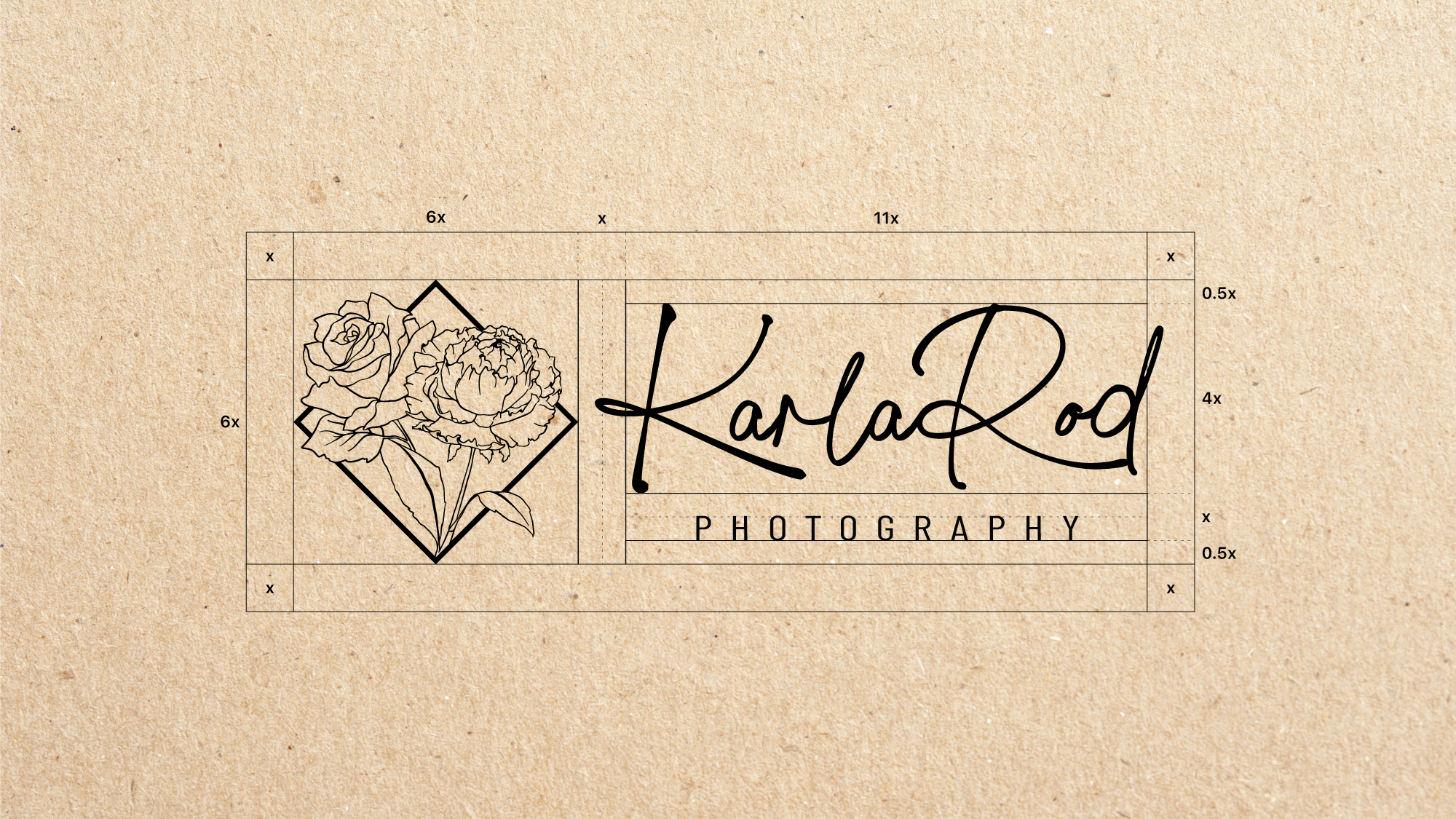
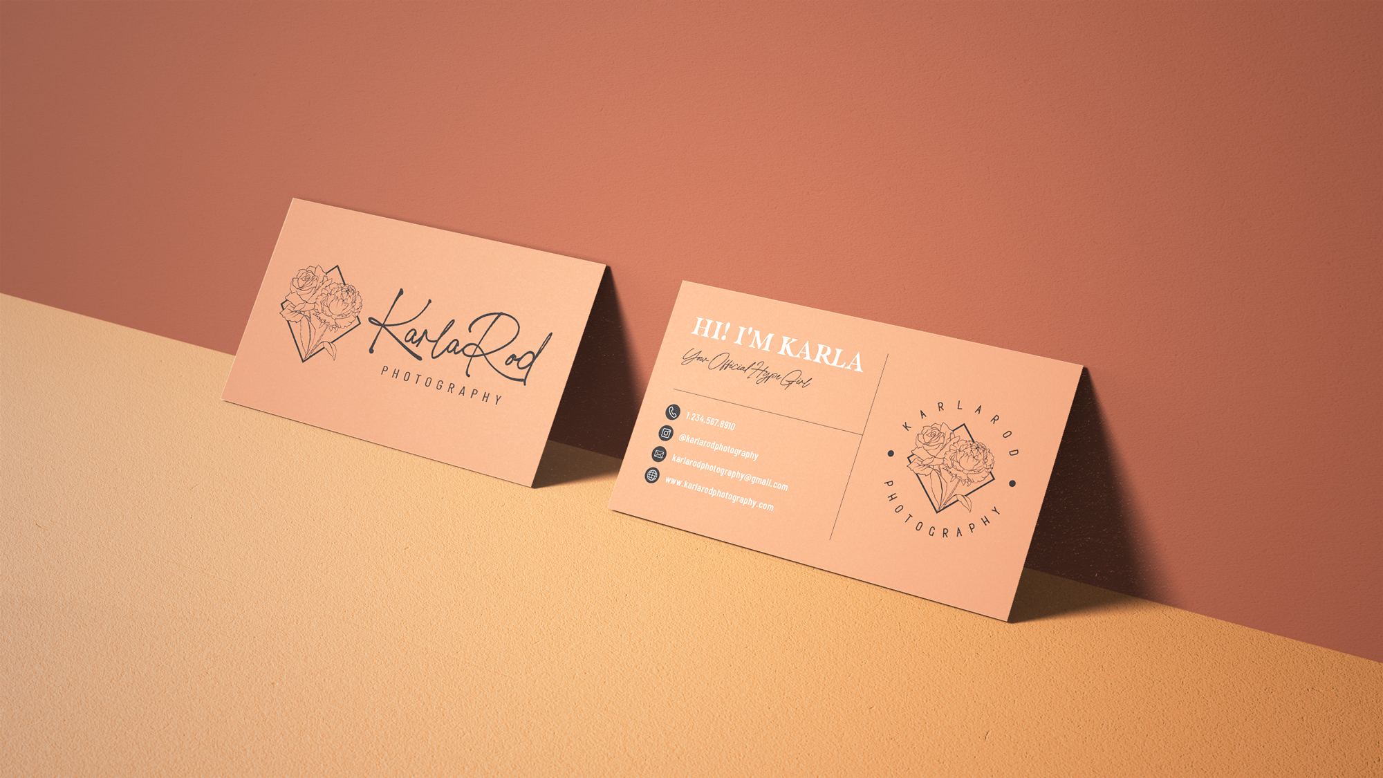
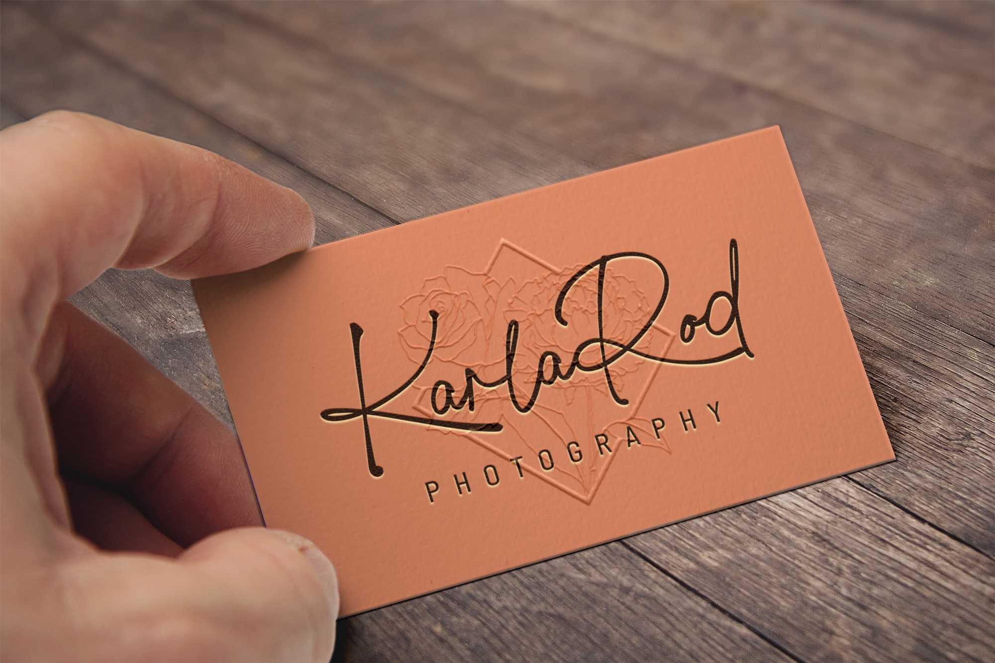
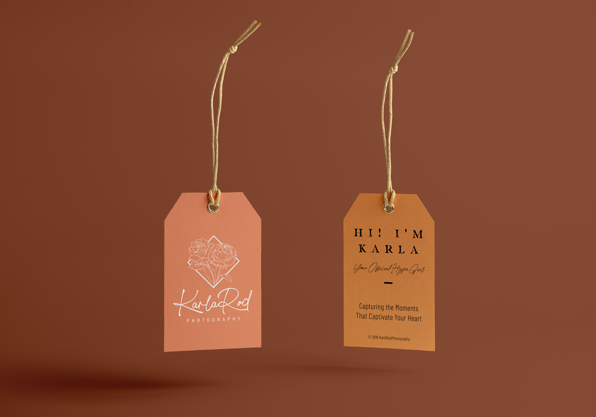
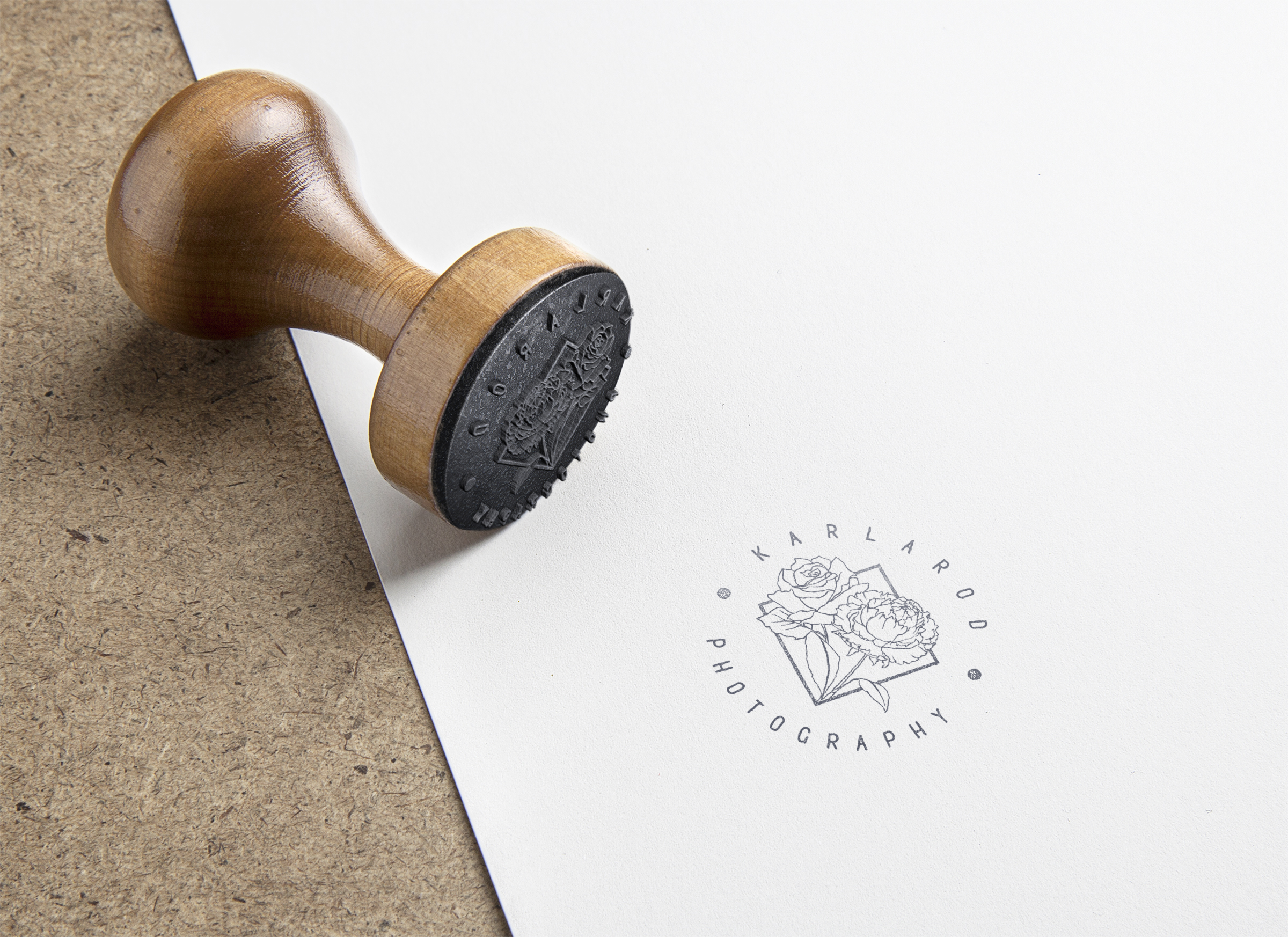
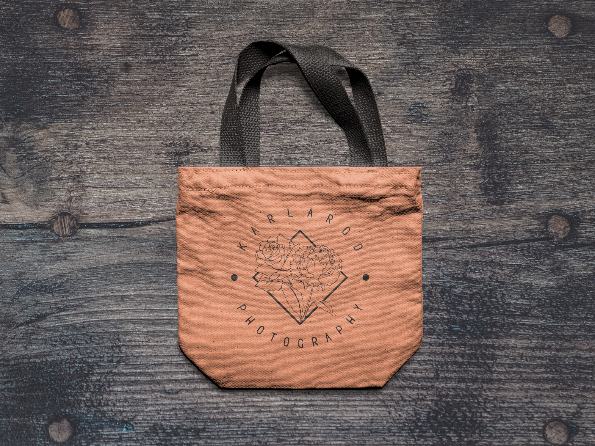
The goal of this project was to create a easy going and fun logo for KarlaRod Photography. The top 5 highlights that will determined a success for the brand's visual identity: (Aesthetically pleasing. Fun/Playful. Relatable. Passionate. Personal). The brand mark needed to include a rose and carnation. These flowers represented the client's two children and their corresponding birth flowers. They were the sole reason why the client continued her career in photography so they represent a strong foundation within her business.
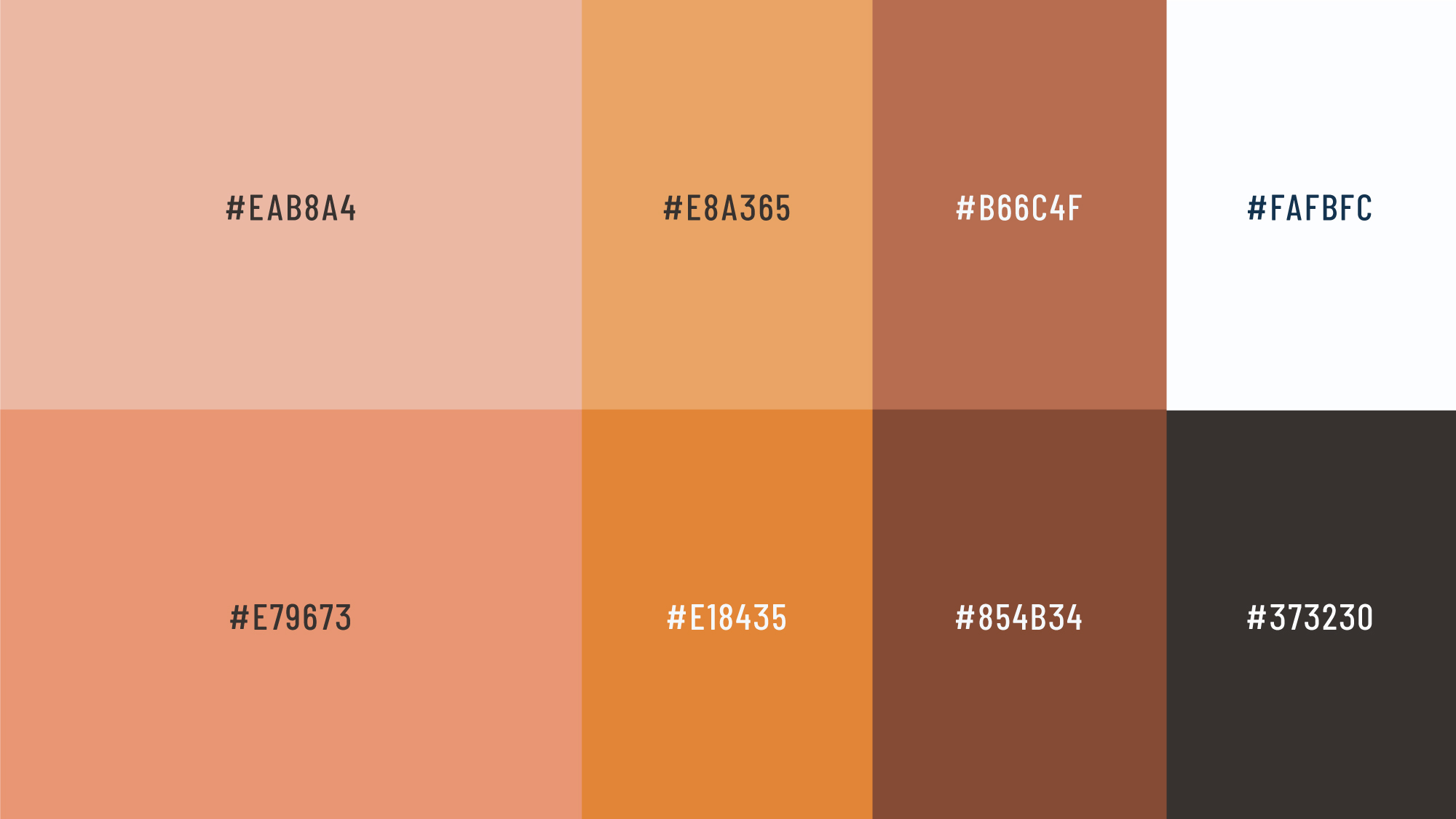
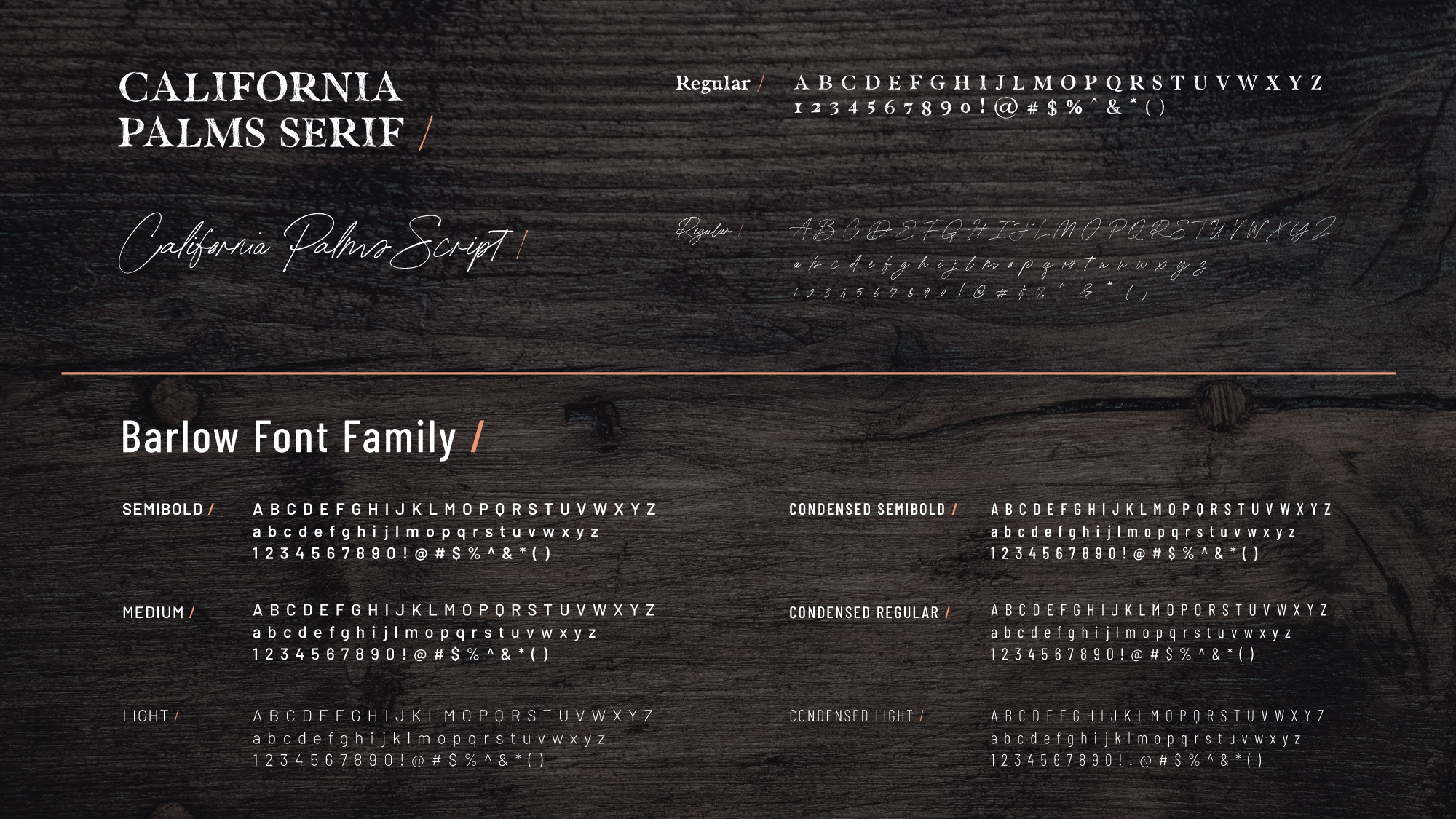
The color palettes will consist of nudes, browns, and peach colors. The font will consist of a more playful font direction like loose sans serifs, scripts, and brush fonts. The goal is to stray away from typography that is too serious and corporate looking.